Company: FrameWorks Focus: Brand expression that supports product clarity Context: Internal tools used across teams Evidence: Identity tokens, typography system, spacing rules, before/after system application
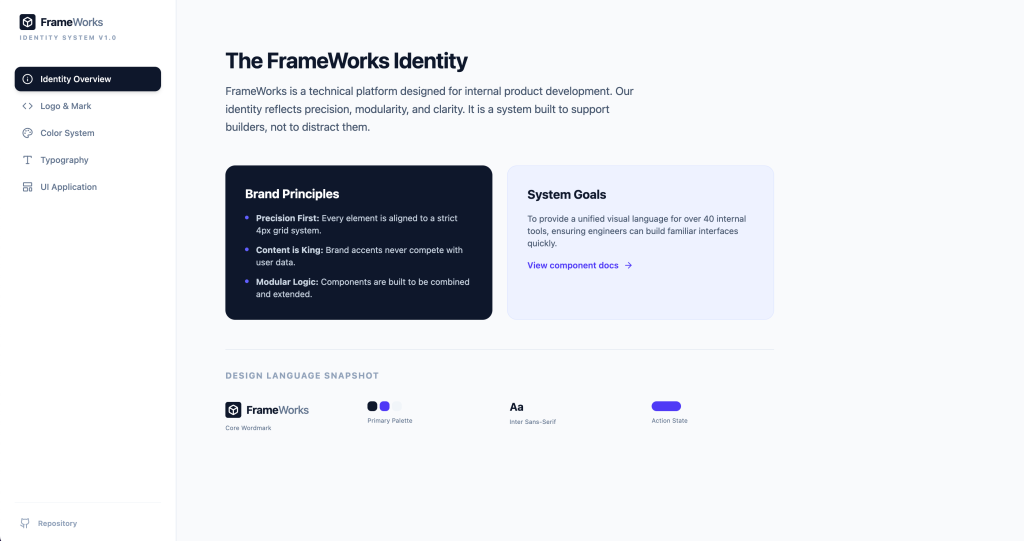
FrameWorks wasn’t built to decorate products. It was built to standardize them.
Multiple teams were shipping UI with inconsistent spacing, color usage, and component logic. The problem wasn’t creativity — it was entropy.
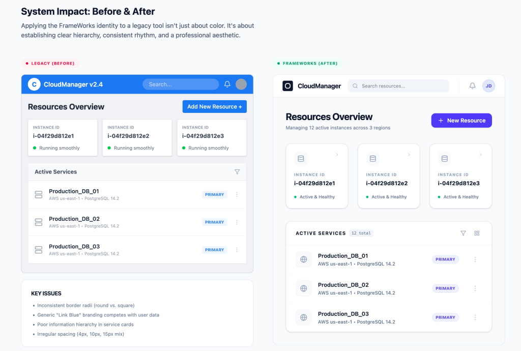
Different tools interpreted brand loosely. Hardcoded colors and inconsistent spacing created drift.
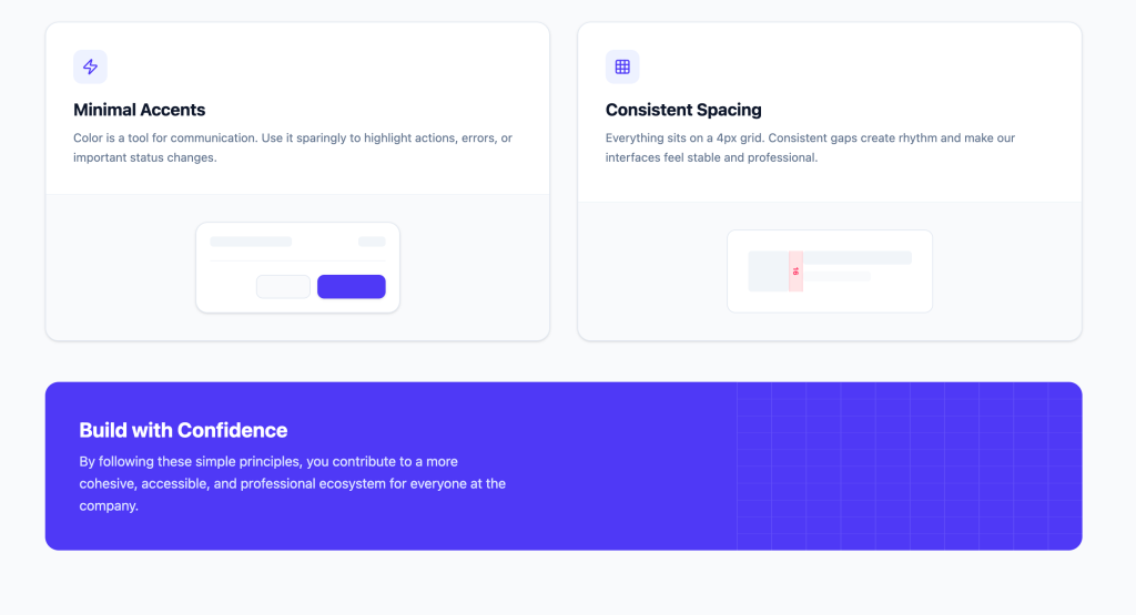
Minimal accents, strict 4px scale, and defined typography weights created rhythm and scan clarity.
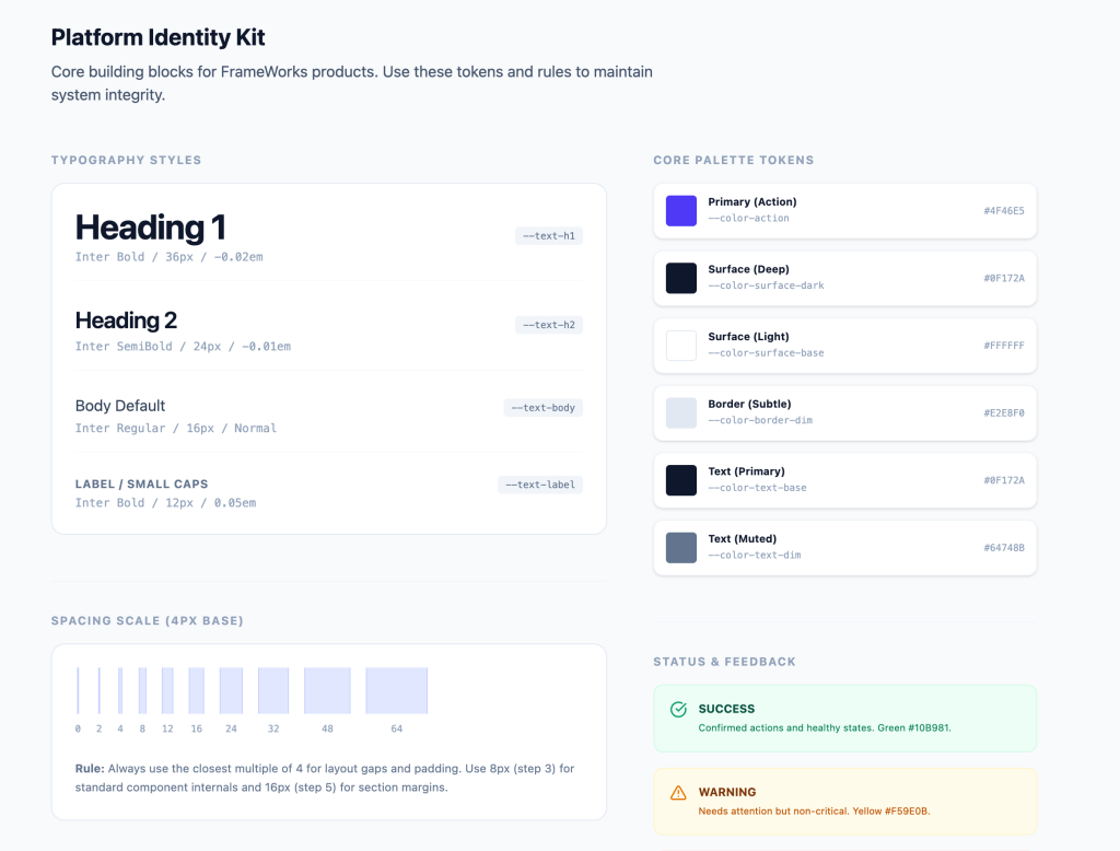
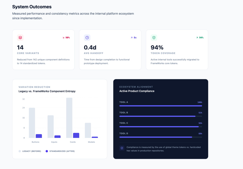
Color, spacing, and typography were abstracted into reusable tokens — eliminating guesswork at implementation.
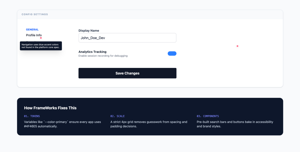
Before & After
Brand was embedded into real workflows without changing product logic — improving readability without disruption.
Compliance and adoption were measurable. Consistency became operational, not aspirational.