
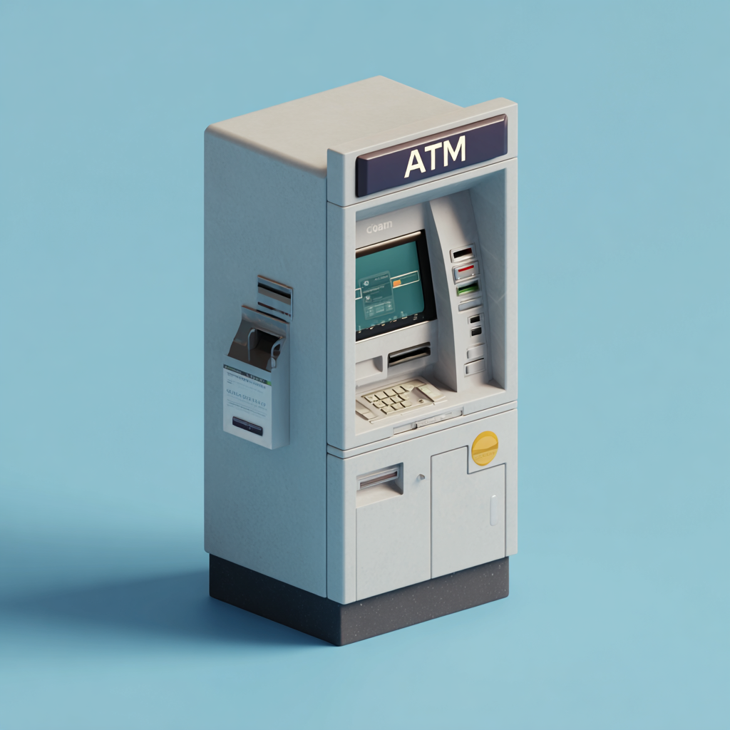
I’ve been thinking about the ATM at my bank.
Not because it’s beautiful — it’s not. Not because it’s innovative — it’s fairly standard. But because every time I use it, the transaction is so smooth, so predictable, so forgettable that I never think about it. I walk up, insert my card, enter my PIN, select an amount, take my cash, and leave.
Nothing interesting happens. And that’s exactly why it’s good design.
The Paradox of Great Design
There’s a strange paradox in design: the better it is, the less you notice it.
Good design doesn’t announce itself. It doesn’t demand attention or ask for applause. It just works — so seamlessly that it fades into the background of your life. You don’t think about the door handle that opens effortlessly, the traffic light that gives you just enough time to cross, or the coffee maker that starts brewing exactly when you need it.
You only notice design when it fails. When the door is heavy and awkward. When the light changes too fast. When the interface confuses you or the process frustrates you.
That’s when design becomes visible — because suddenly, it’s in your way.
Everyday Invisible Excellence
Once you start looking for it, you see invisible design everywhere.
Airport signage that guides you to your gate without making you think. Crosswalks that intuitively tell you when it’s safe to walk. Packaging that opens easily on the first try. Elevators that arrive quickly and take you exactly where you need to go.
None of these experiences are memorable. But they’re all essential. They’re the quiet infrastructure of daily life — designed to be so clear, so intuitive, so obvious that they require zero mental effort.
And that’s the goal.
What This Means for Product Design
In product design, we talk a lot about delight. Micro-interactions, animations, moments of surprise that make people smile. And those things have their place — they build personality, create emotional connection, and make experiences feel human.
But I’ve come to believe that the most powerful design isn’t delightful. It’s effortless.
It’s the login flow that just works. The search bar that finds what you’re looking for on the first try. The checkout process that doesn’t make you second-guess whether you entered your information correctly. The dashboard that shows you exactly what you need, without clutter or confusion.
These aren’t flashy. They won’t win design awards. But they earn trust. And trust, over time, is more valuable than delight.
The Discipline of Restraint
Designing for invisibility requires restraint.
It means resisting the urge to add unnecessary flourishes. It means prioritizing clarity over cleverness. It means asking, Does this serve the user, or does it serve my ego as a designer?
It also means being okay with your work going unnoticed. Because if people aren’t talking about your design, it might just mean it’s working exactly as it should.
I think about this every time I design a workflow or refine an interface. My goal isn’t to make people stop and admire the design. My goal is to help them accomplish what they came to do — quickly, confidently, and without friction.
If they leave thinking, That was easy, I’ve done my job.
The Quiet Confidence
There’s a quiet confidence in designing for invisibility. It’s the confidence that comes from knowing your work doesn’t need to shout to be effective. It doesn’t need decoration to be valuable. It just needs to work.
And when it works — really works — it becomes part of the background. It fades into the rhythm of someone’s day. It becomes so natural, so expected, that people stop noticing it’s even there.
That’s not a failure. That’s the goal.
Because good design feels like nothing happened. And sometimes, nothing happening is exactly what people need.