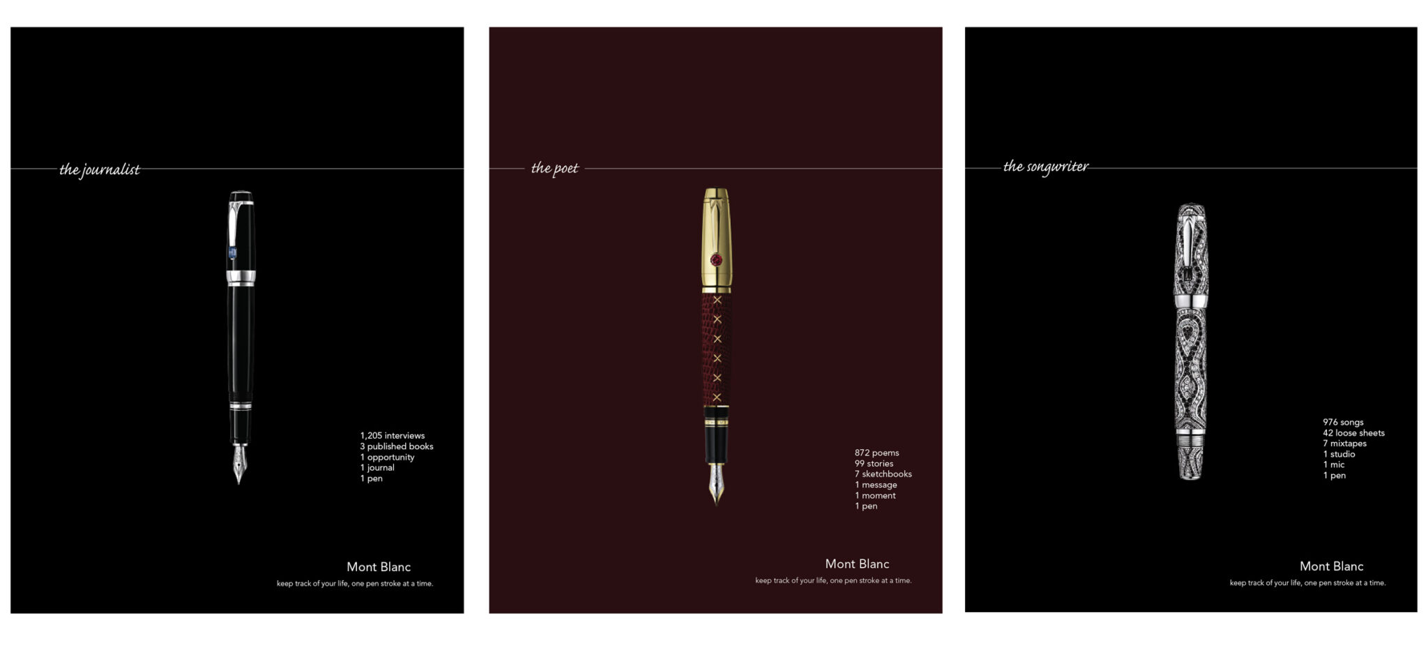
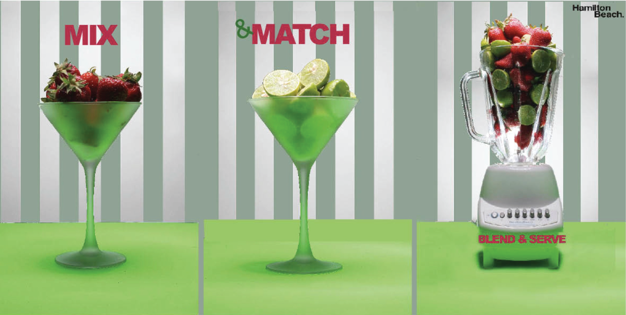
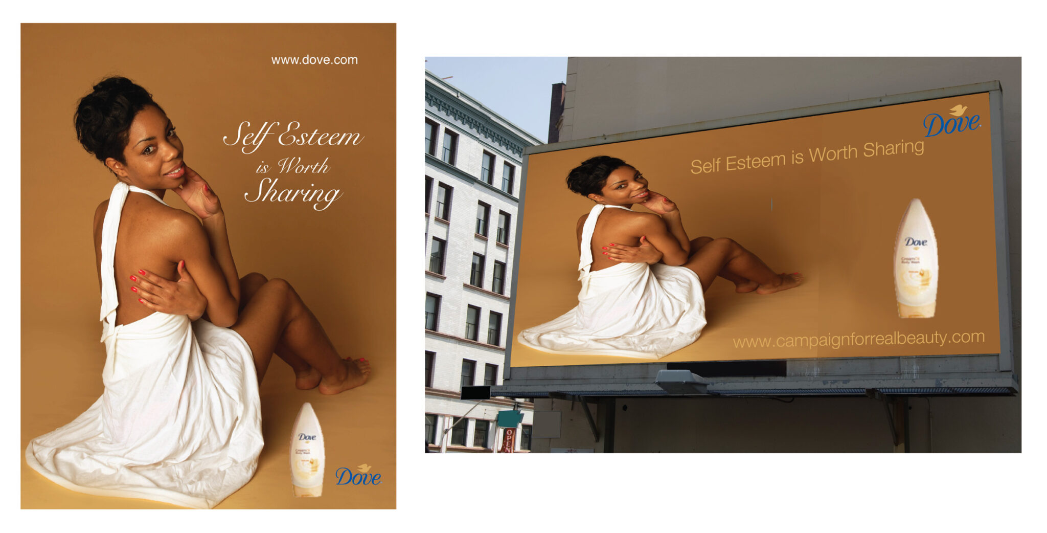
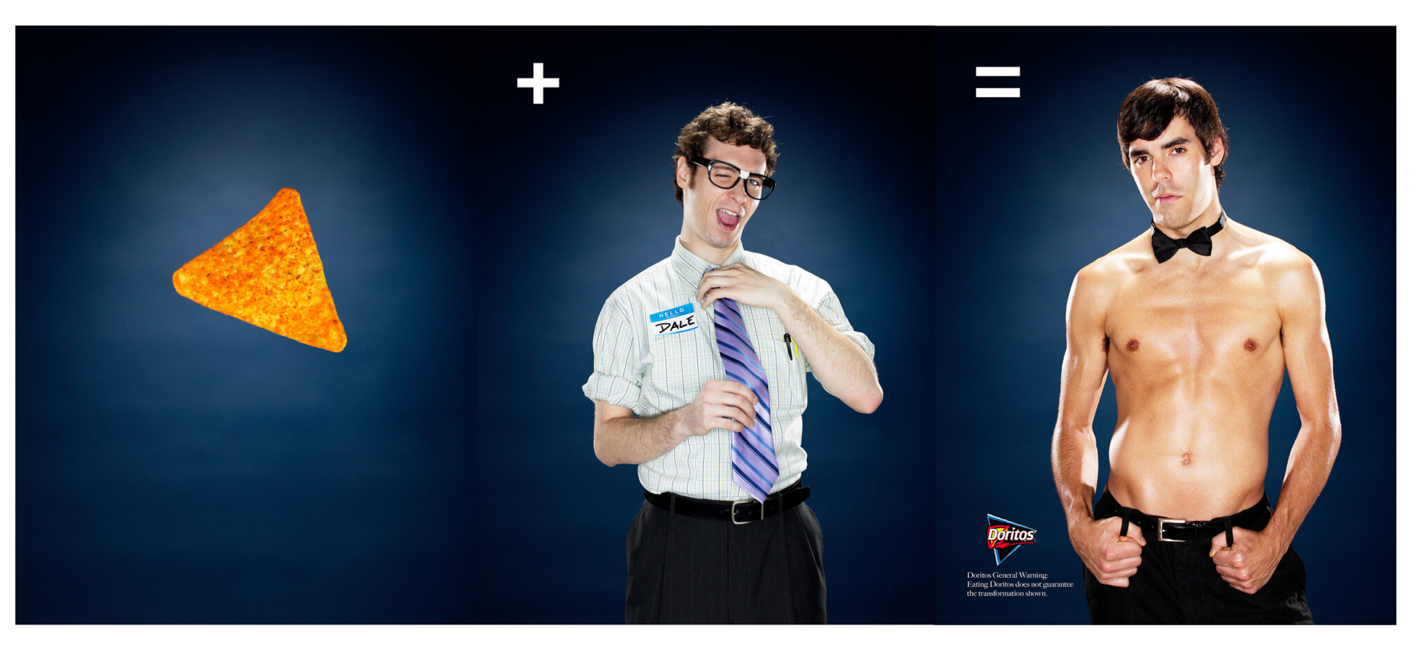
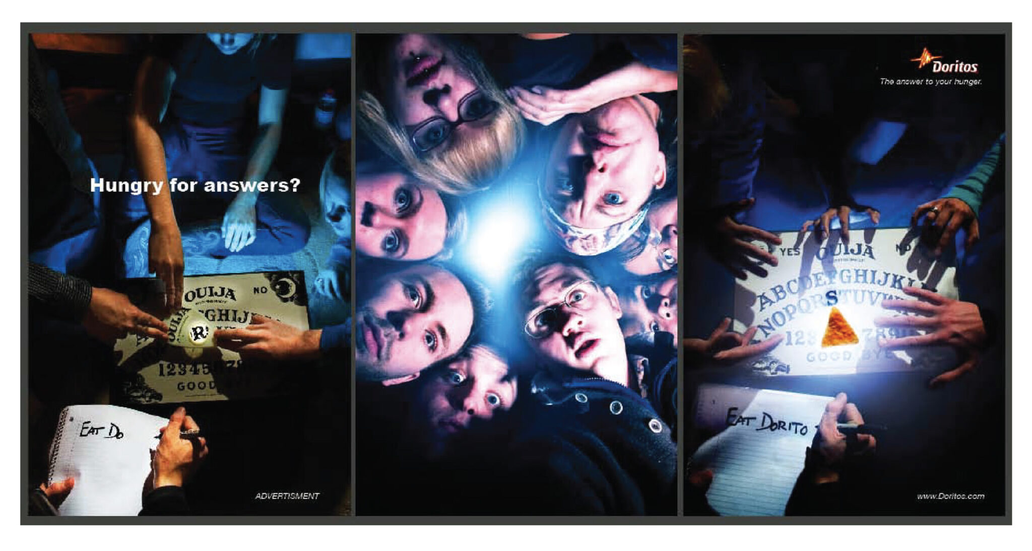
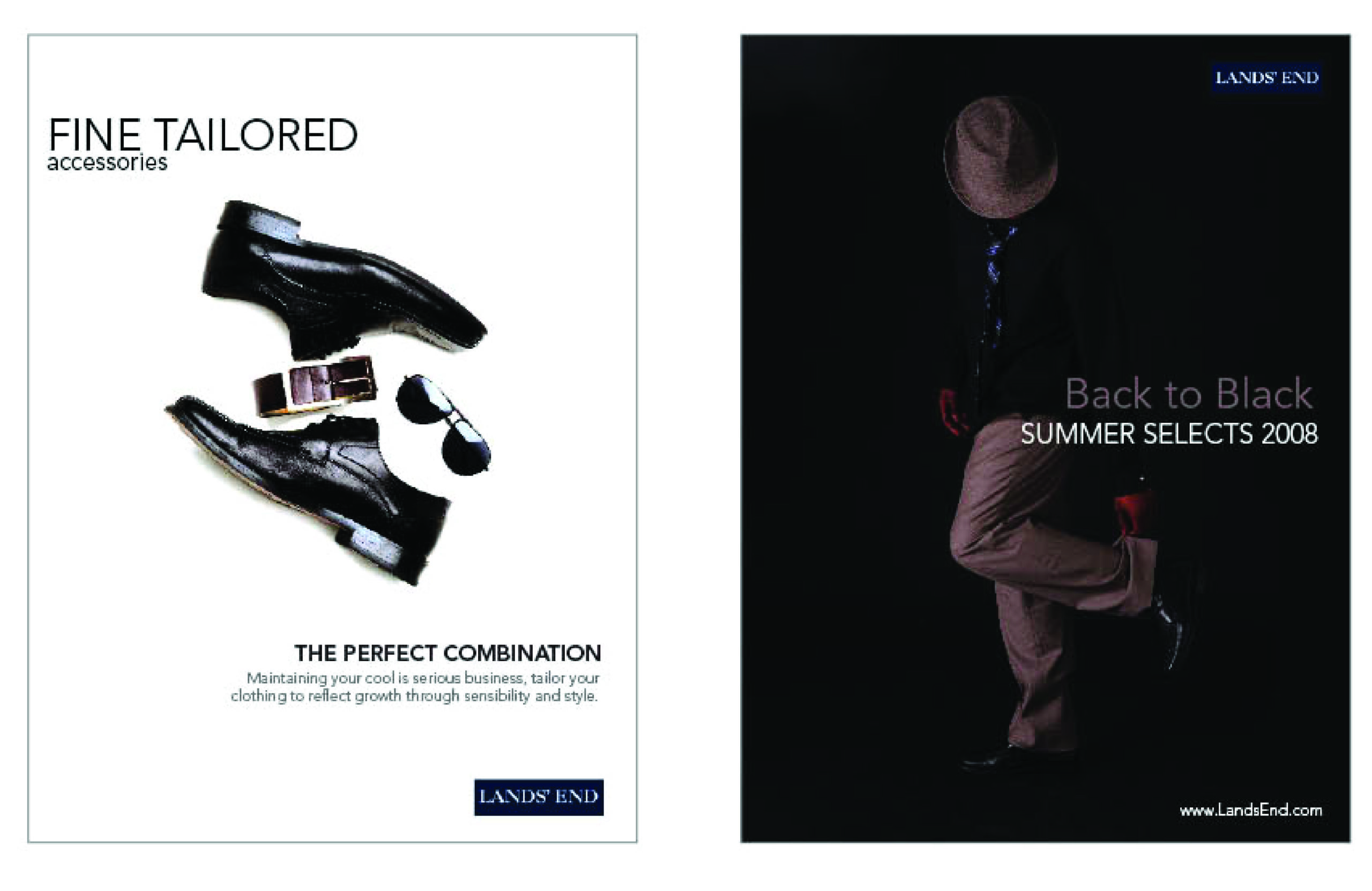
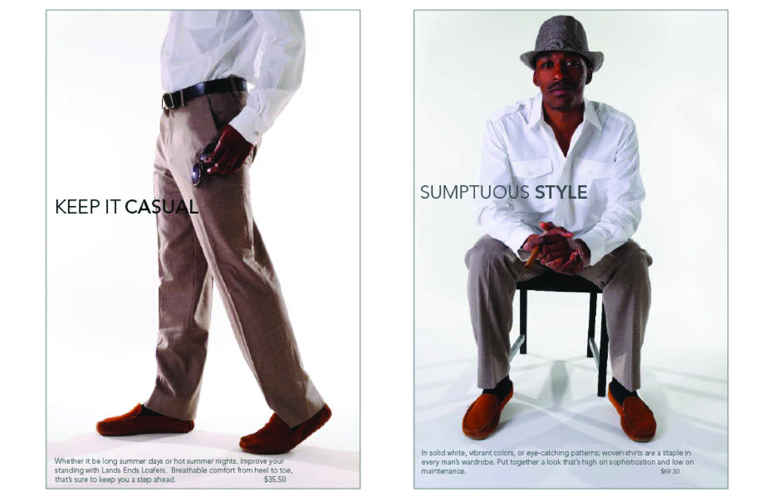
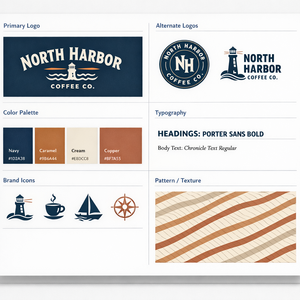
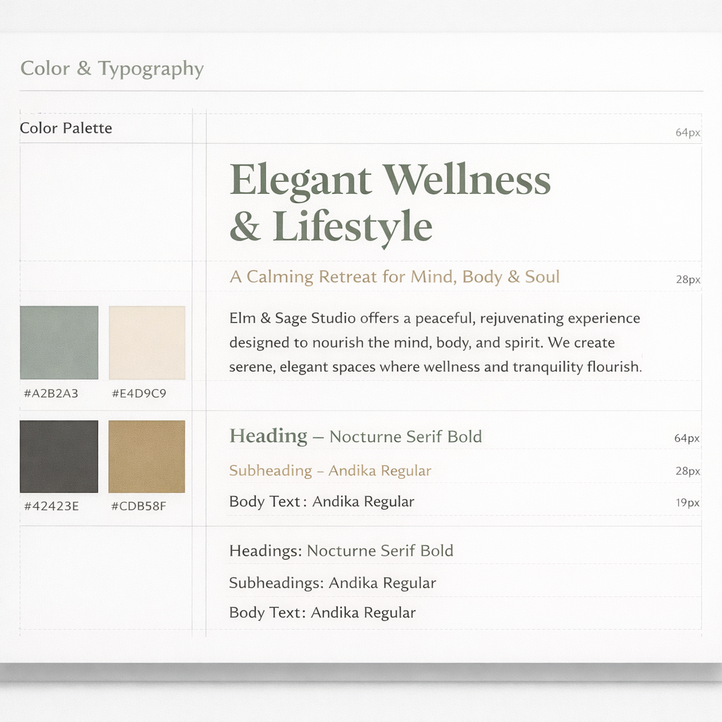
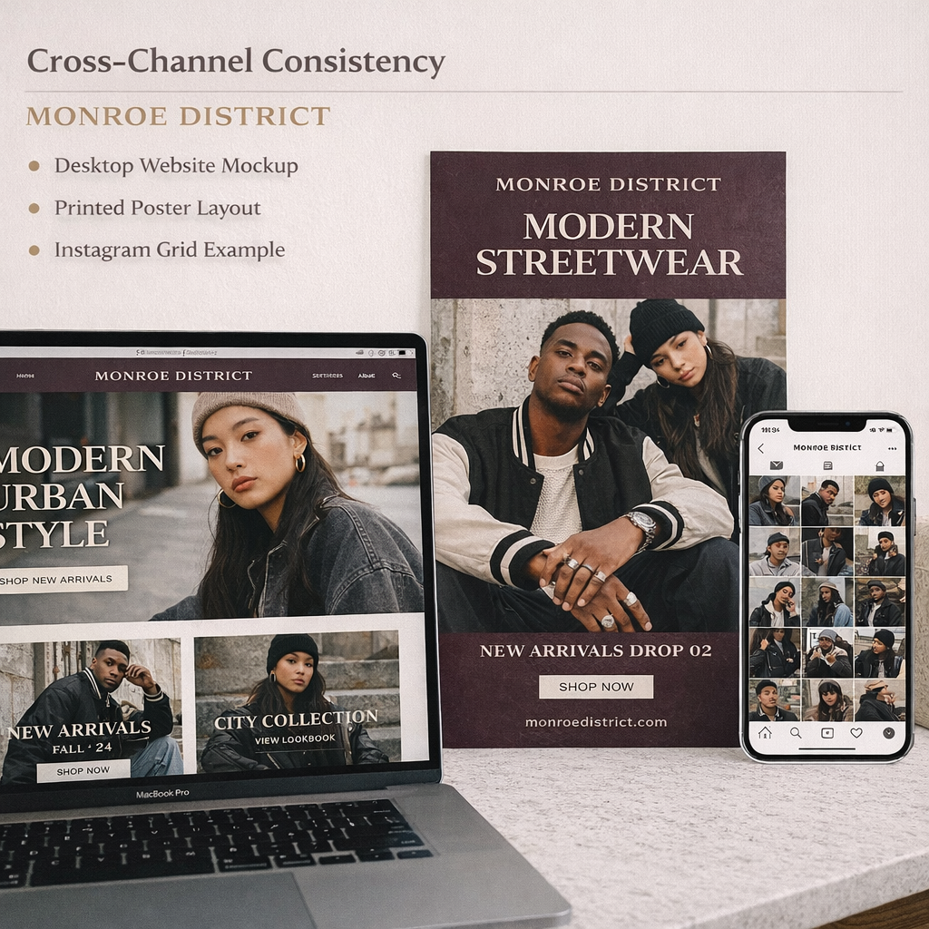
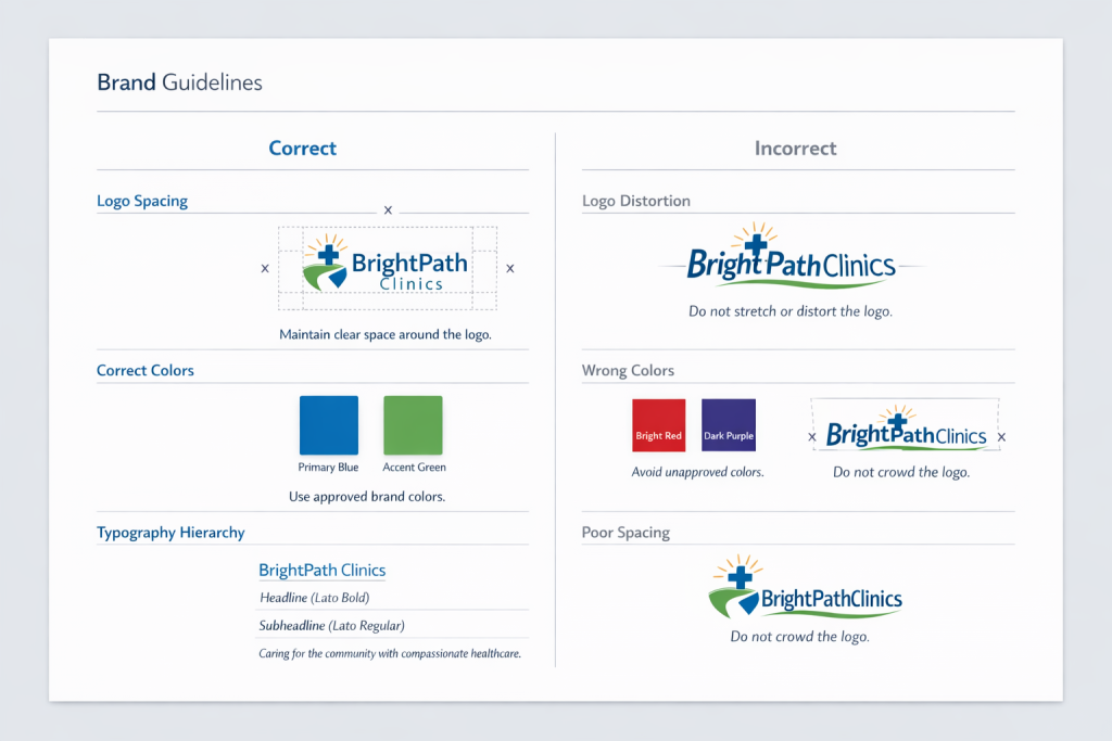
Art Direction & Brand SystemsBy Whitney Cullens / February 10, 2026 Unified Brand System Across 6+ TouchpointsReduced Visual Inconsistency by ~30% Across AssetsStandardized Hierarchy, Color, and Typography RulesReusable Framework Applied to Print, Web, Fleet & Campaign I define the visual rules that keep a brand consistent and recognizable across every space it shows up. The full visual system: logo structure, color palette, typography, and spacing rules. Color and typography work together to create hierarchy and tone. The icon system is built with consistent stroke weight, proportion, and spacing. Consistent typography, color, and layout structure ensure the brand feels unified in every format. Clear usage guidelines protect the integrity of the brand This campaign extends the core brand system into real marketing assets. Brand systems taught me that design works best when rules are clear. That same thinking guides how I build product systems. Creative Foundations