+22% increase in primary CTA clicks through hierarchy and layout refinement Reduced bounce rate by 18% by clarifying navigation and page flow Built reusable UI component system, cutting future page build time by ~30% Improved mobile engagement by 25% through responsive restructuring and accessibility improvements
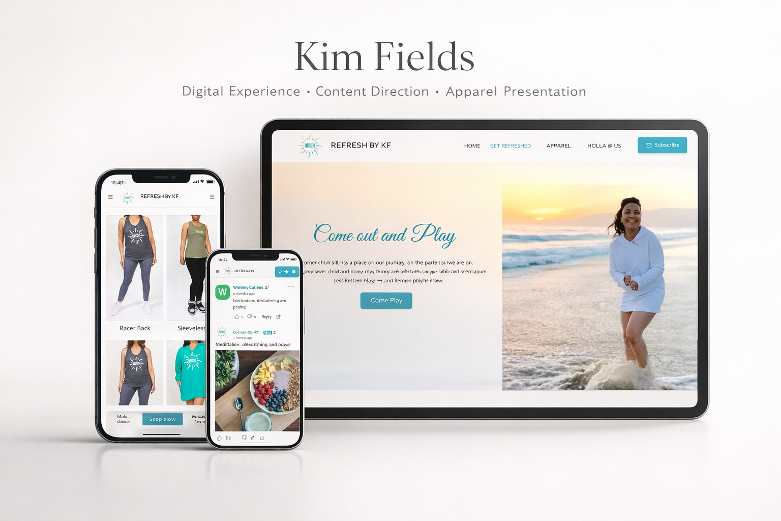
I build digital spaces like architecture: layered, structured, intentional.
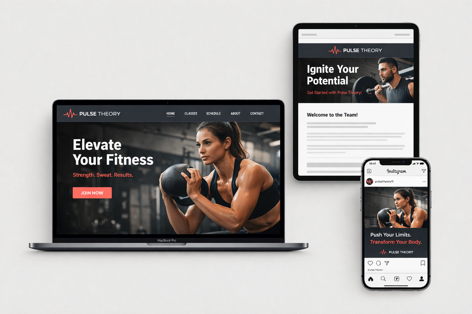
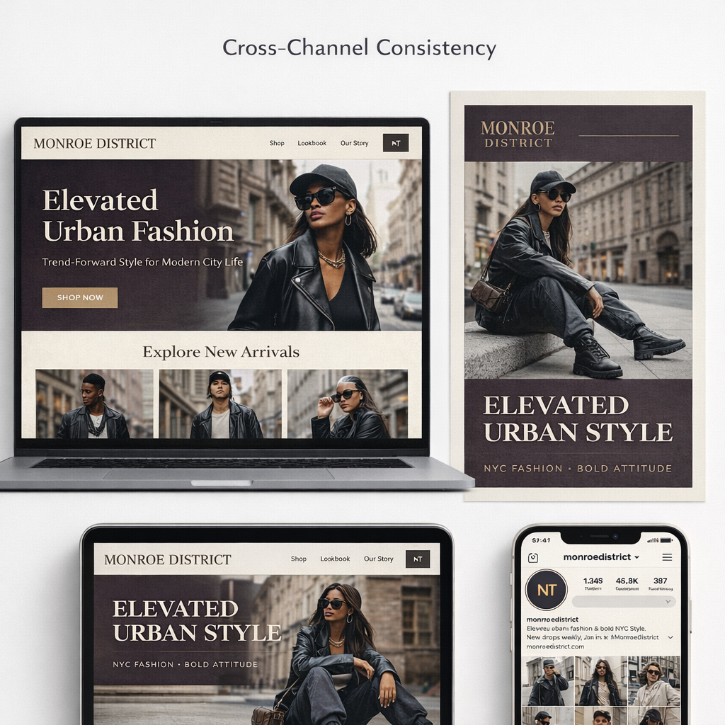
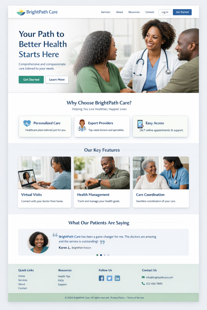
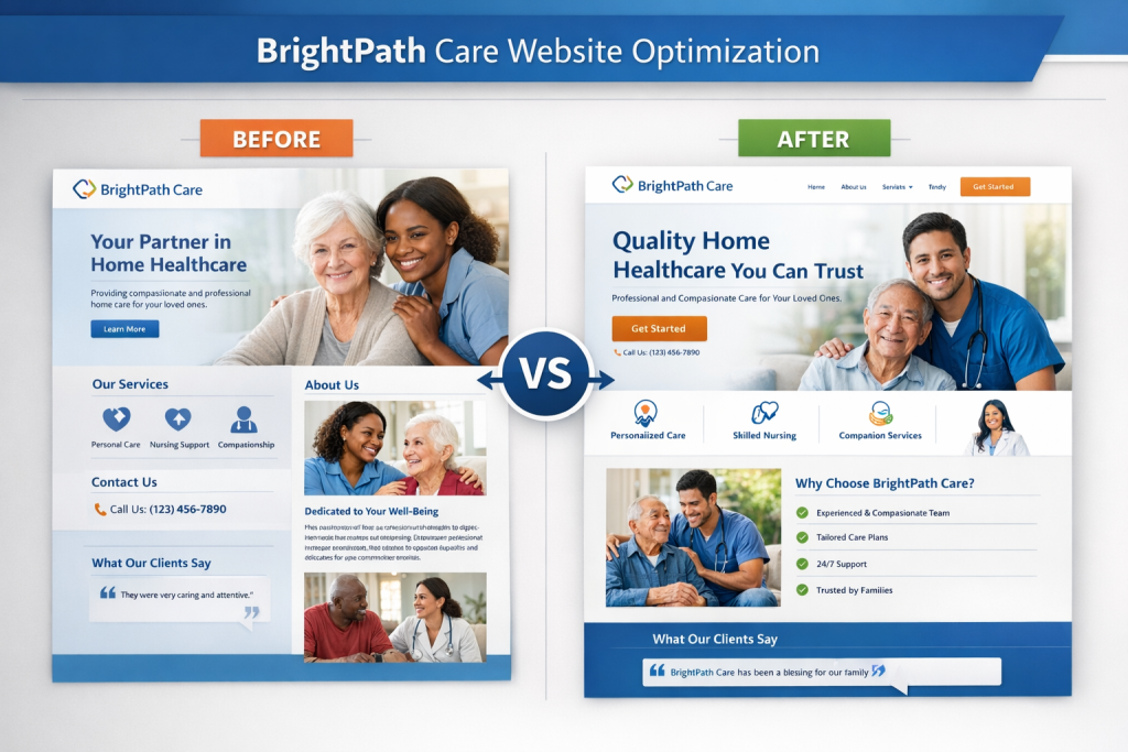
Clear messaging and layout guide users toward primary actions without overwhelming them.
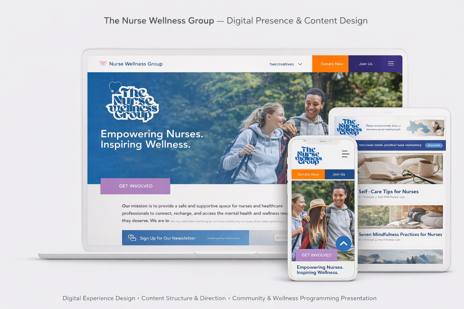
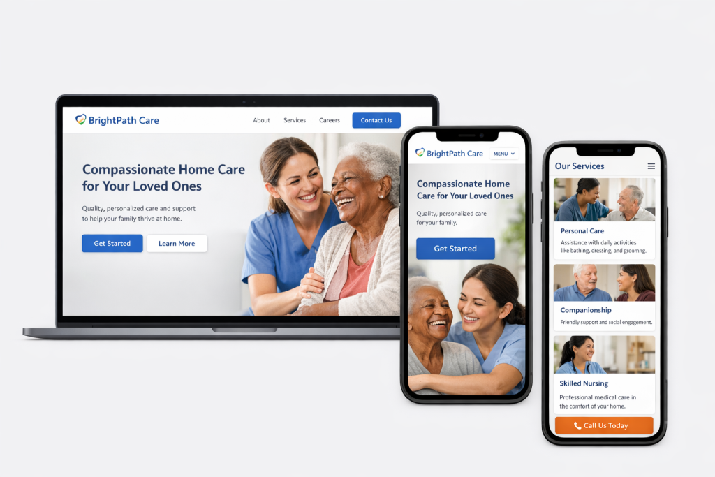
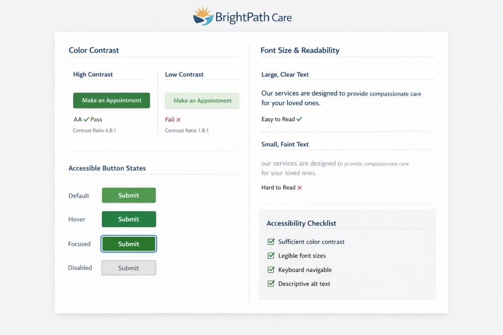
The mobile experience prioritizes clarity and accessibility.
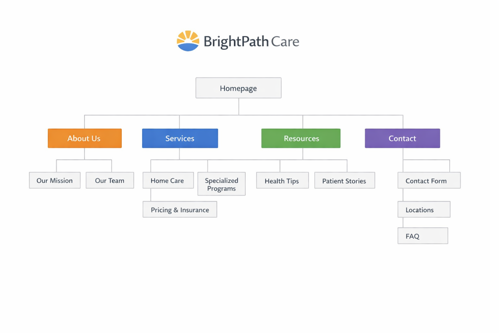
A clear information architecture reduces friction and supports user navigation.
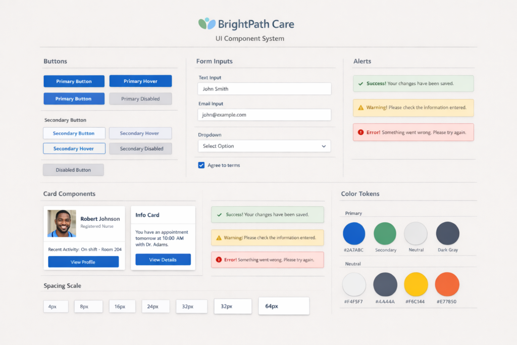
Reusable components ensure consistency and efficiency.
Strategic layout refinements improved clarity and user flow. Strong hierarchy leads to better engagement and decision-making.
Thoughtful color contrast, readable typography, and clear states make the experience inclusive and reliable.
Web work taught me to think in layers, navigation paths, and reusable systems. That same mindset drives how I approach scalable product design.