
I renewed my car tags online through NC DMV.gov and almost didn’t notice how good it was.
That’s the whole story. But let me back up.
I sat down expecting the DMV experience. You know the one. Confusing, clunky, three broken links and a PDF you have to print, sign, scan, and email back to a fax number or by courier pigeon. I had my armor on. I was ready to be frustrated.
Instead it just worked.
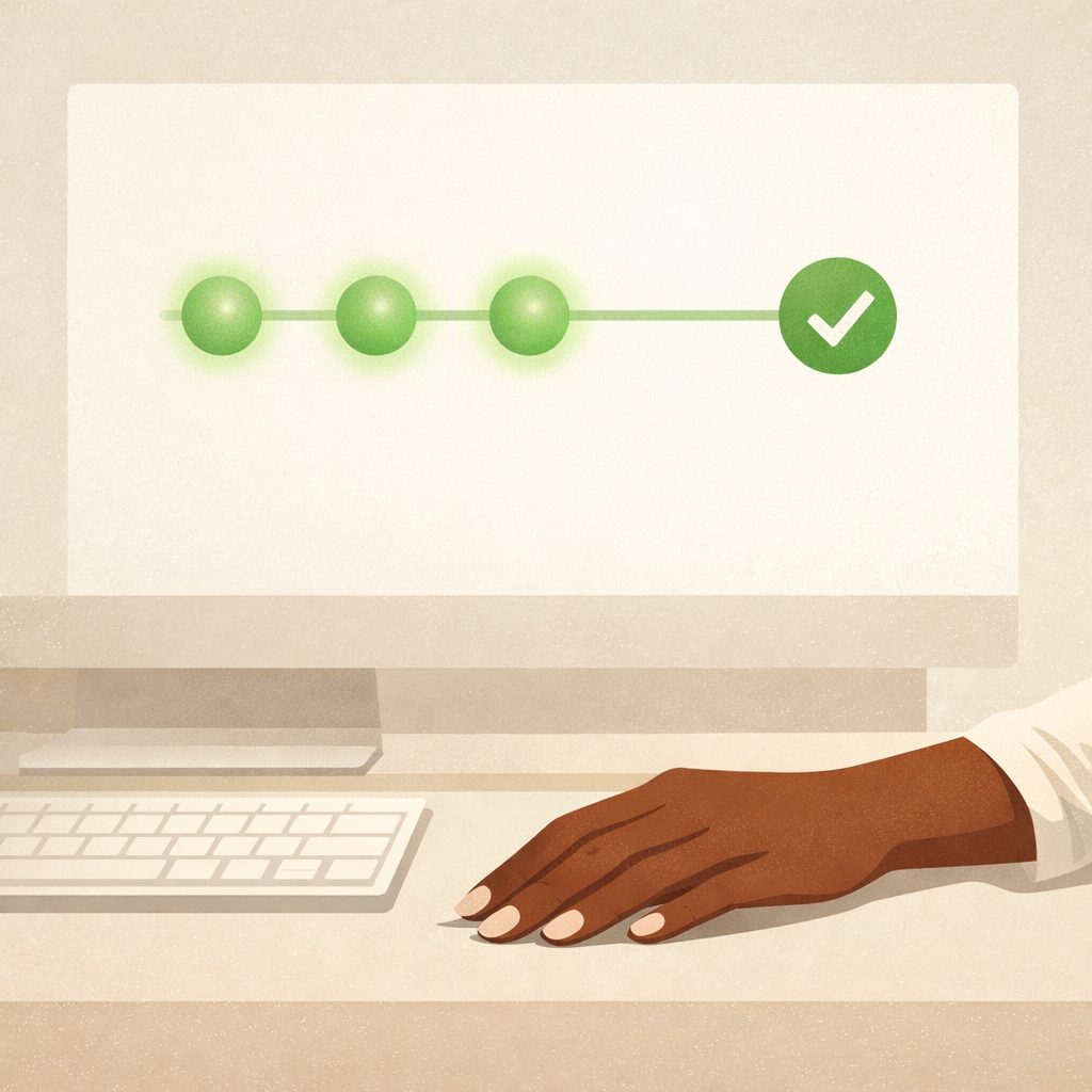
Step by step, clear communication, nothing ambiguous. The kind of flow where you always know where you are, what comes next, and what happens if you need to stop and come back. No feeling of being locked in until payment. No moment of did I do that right. Just a steady, calm, we got you kind of experience all the way through.
It even caught something I missed. I hadn’t completed my state safety inspection yet and instead of letting me barrel through and hit a wall later, the system flagged it early. Gently. Informatively. Not an error message that made me feel like I broke something. Just a heads up that redirected me without derailing me. I got the inspection done, the results were automatically sent to the DMV, and when I came back to the site it picked up right where I left off.
The only thing I missed was a screen that gave me the option to customize my plate. Sailed right past it. And honestly that’s a compliment. The flow was so smooth I was already moving before I realized there was a detour available. I like that the option exists. I’ll catch it next year.
There’s a word for this in design. Invisible.
Not invisible like it disappeared. Invisible like it got completely out of your way. Like it trusted you to complete the task and built the whole experience around that trust instead of around covering itself.
The DMV has a reputation. It has earned that reputation across decades of lines, paper forms, a little slip with a number on it, a digital screen to watch, and you better not miss it when they call you. Systems that feel like they were designed to discourage you from trying. So when a government platform quietly delivers one of the smoothest digital experiences you’ve had in recent memory, you notice. Or more accurately, you don’t notice until it’s over and you’re holding your confirmation number thinking wait, that was it?
That’s the goal. That’s the whole job.
Good design doesn’t announce itself. It doesn’t ask for applause or wait to be admired. It just removes every reason for you to stop, second guess, or give up. And when it works, really works, you walk away thinking that was easy without knowing exactly why.
In product design we talk a lot about delight. The micro-interactions, the moments of surprise, the personality that makes an experience feel human. And those things matter. But the most powerful design isn’t the part that makes you smile. It’s the part that makes you forget you were ever worried.
Trust is built in the invisible moments. In the flag that caught your mistake before it became a problem. In the step that let you pause without losing your progress. In the confirmation that arrived in your mailbox exactly when it said it would.
None of that is glamorous. None of it wins awards. But it earns something better. The quiet confidence of a person who comes back next year without hesitation.
If people leave thinking that was easy, you’ve done the work.
If they don’t think about your design at all, it might just mean it’s working exactly as it should.
Nothing happening is sometimes everything.
Whitney Cullens is a product designer who believes the most powerful user experience is the one nobody has to complain about.