
In second grade I drew Clifford the Big Red Dog on an 18×24 sheet of paper.
I don’t know if it looked exactly like him or if it was just obvious because the dog was big and red. But I’m going to give myself credit, because I never missed a detail back then and I don’t miss them now. Every kid in the room recognized it. I remember that feeling. Not just pride. Recognition. The moment you realize your hands can make something other people can see.
That was the beginning.
By high school I was working in oils, charcoal portraits, ceramics. Realistic portraits with shading, the kind where you have to really look at a face before you can draw it. You learn to see before you learn to render. That’s the whole lesson right there and it took me years to understand how much it would matter later.
Fine art and product design share the same bones.
Composition, balance, contrast, rhythm, hierarchy. Every principle I learned mixing cadmium red with ultramarine blue, every decision I made about where the eye travels on a canvas, shows up in every interface I build. Color isn’t decoration. It’s language. Warm colors advance. Cool colors recede. A soft blue background doesn’t just look calm, it creates trust. A red button doesn’t just look urgent, it feels urgent. These aren’t instincts I developed in a product design course. They came from years of making things with my hands and watching how visual choices shape what people feel.
Negative space is the other one. One of the hardest lessons in fine art is knowing when to stop. Resisting the urge to fill every corner of the canvas until the piece loses its clarity. I see that same impulse in digital design constantly, elements competing, nothing breathing, everything shouting at once. The best work knows when to hold back. Clarity comes from subtraction, not addition. I learned that with a paintbrush before I ever touched a design tool.
Here’s what it looks like in practice.
On the Wrench Connect project, we were working with a data dense interface, multiple projects, multiple addresses, all living inside the same table view. It was technically functional. But something was off. The eye had nowhere to land. Everything carried the same visual weight so nothing stood out.
The fix wasn’t complicated. Better contrast between rows. Clearer hierarchy within each project. A quick visual separation that let the user scan without having to work for it. Small moves, but they came from the same place as every painting I’ve ever made. You read the composition first. Then you fix what the eye can’t find.
That’s the fine art eye. It’s not about making things pretty. It’s about making things readable. Trustworthy. Clear.
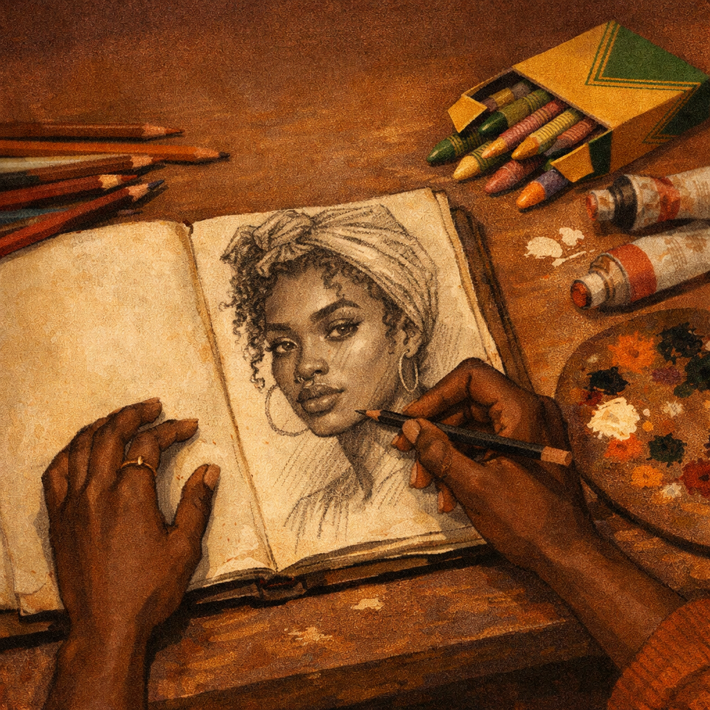
My path into design started with a Crayola 64 box, Prismacolor pencils, watercolors, and sketchbooks. It ran through home economics, ceramics, my grandma’s kitchen, charcoal portraits in 9th grade, and eventually into pixels and prototypes.
Product design and fine art aren’t separate disciplines. They’re different expressions of the same thing. The desire to communicate. To solve problems. To make something that actually resonates with the person on the other side of it.
I’m grateful every day that I get to do both.
Whitney Cullens is a product designer who learned to see before she learned to build. Turns out that’s the order it was always supposed to go.